
UI/UX Design Process: 8 Stages Explained From the Client Side
The UI/UX design process is the route a digital product takes from a rough idea to tested screens that developers can build. Seen from the client side, it runs through eight stages, and each one requires specific input from you. This guide shows what a UI/UX design team delivers at each stage, who should join the reviews and how long each step takes.
Most guides explain the process from the designer's desk. This one explains the UI/UX design process for the person paying for it, whether that is a founder, a product owner or a marketing head. For each stage you get the deliverables, the questions to prepare and a time estimate with its assumptions stated. You also get the checks that matter for Indian users, covering budget Android phones, Hindi screens and UPI payments.
Key Takeaways
- The UI/UX design process has eight client-facing stages, from discovery and research to post-launch fixes, and each one ends with something you approve.
- Slow feedback stretches every stage, so name one decision-maker and agree on a review turnaround before any design work starts.
- Nielsen Norman Group found that five users per test round uncover about 85% of usability problems, so small repeated tests beat one big study.
- WCAG 2.2 gives your designers concrete targets, such as 4.5:1 contrast for normal text and touch targets of at least 24 by 24 CSS pixels.
- For Indian users, plan Hindi or other Indic screens, a wide spread of Android phones and every UPI payment state from the first wireframe.
What the UI/UX Design Process Looks Like From Your Side
Designers lean on frameworks to keep the work honest. The best known is the Double Diamond from the UK Design Council, which grew out of the council's 2003 effort to describe the design process. It splits a project into four phases called Discover, Define, Develop and Deliver. The first two phases identify the right problem to solve, and the final two develop and validate the right solution.
Nielsen Norman Group describes design thinking in six phases, from Empathize to Implement, and groups them into three buckets: understand, explore and materialize. The point that matters most for a client is that teams loop back between phases instead of moving in a straight line. When a usability test sends you back to research, that is the process doing its job rather than failing.
An agency turns these frameworks into practical stages with clear outputs, and IfStatic's own UI/UX service page lists four of them. Those are research and requirement analysis, wireframing and user flow mapping, UI design and prototyping, and final delivery with developer handoff. The eight stages below split those four steps into the individual parts you will actually review and approve, one at a time.
| Stage | What you receive | Tools IfStatic lists | What you provide |
|---|---|---|---|
| 1. Discovery and research | Research summary, user profiles, problem statement, success metrics | Miro, FigJam | Business goals, access to real users, any existing data |
| 2. Information architecture and user flows | Sitemap or app map, flow diagrams for key tasks | FigJam, Miro | Product and service names, rules such as login and payment |
| 3. Wireframes | Low-fidelity layouts for every key screen | Figma | Feedback on content order and priority |
| 4. Visual UI and design system | High-fidelity screens, component library, style guide | Figma, Adobe XD | Brand guidelines, logo files, font licences, final copy |
| 5. Interactive prototype | Clickable prototype you can open on a phone | Figma, Protopie | The journeys that must work end to end |
| 6. Usability testing | Test plan, session notes, ranked findings, revised screens | Figma or Protopie prototype | Help recruiting real users, an observer |
| 7. Developer handoff | Screens marked ready, specs, assets, annotated states | Figma Dev Mode, Zeplin, Jira | Developer access, seat licences, a tech lead |
| 8. Post-launch iteration | UX backlog, updated screens, design system updates | Jira, Figma | Analytics access, support tickets, a small change budget |
Adobe XD appears on the list because it helps when your existing files already live in it. However, Adobe's product page now says XD is in maintenance mode, which is worth knowing before you plan several years of work around it. Ask your design partner where new screens will live, and who will move the older files across if that becomes necessary.
A short word on terminology: UX covers structure and behaviour, meaning what happens, in what order and why. UI is the visible layer of colour, typography, spacing and components that users actually see and touch. Experienced teams work on both together, which is why the stages below mix them rather than running UX first and UI second.
Stages One to Four: From Research to Visual Design
The first half of the UI/UX design process decides what gets built and how it is organised, and changes are cheap here because nothing is polished yet. Challenge every assumption at this point, because a wrong assumption discovered in stage one costs a conversation. The same mistake discovered after launch can mean redesigning the screens and rewriting the code behind them.
Stage 1: Discovery and Research
Discovery is where the design team learns about your business, your users and your constraints before anyone draws a screen. Expect a kickoff workshop, interviews with the people who talk to customers every day, a review of competitors and a look at your analytics. Where time allows, the team also interviews a handful of real users about how they solve the problem today.
You receive a research summary, short user profiles or personas, a clear problem statement and the success metrics that everyone agrees to track. From your side, the founder or product owner should attend, together with someone from sales or customer support who hears complaints first-hand. Our planning estimate is one to two weeks for a mid-sized application, and it goes faster when you prepare answers to these questions.
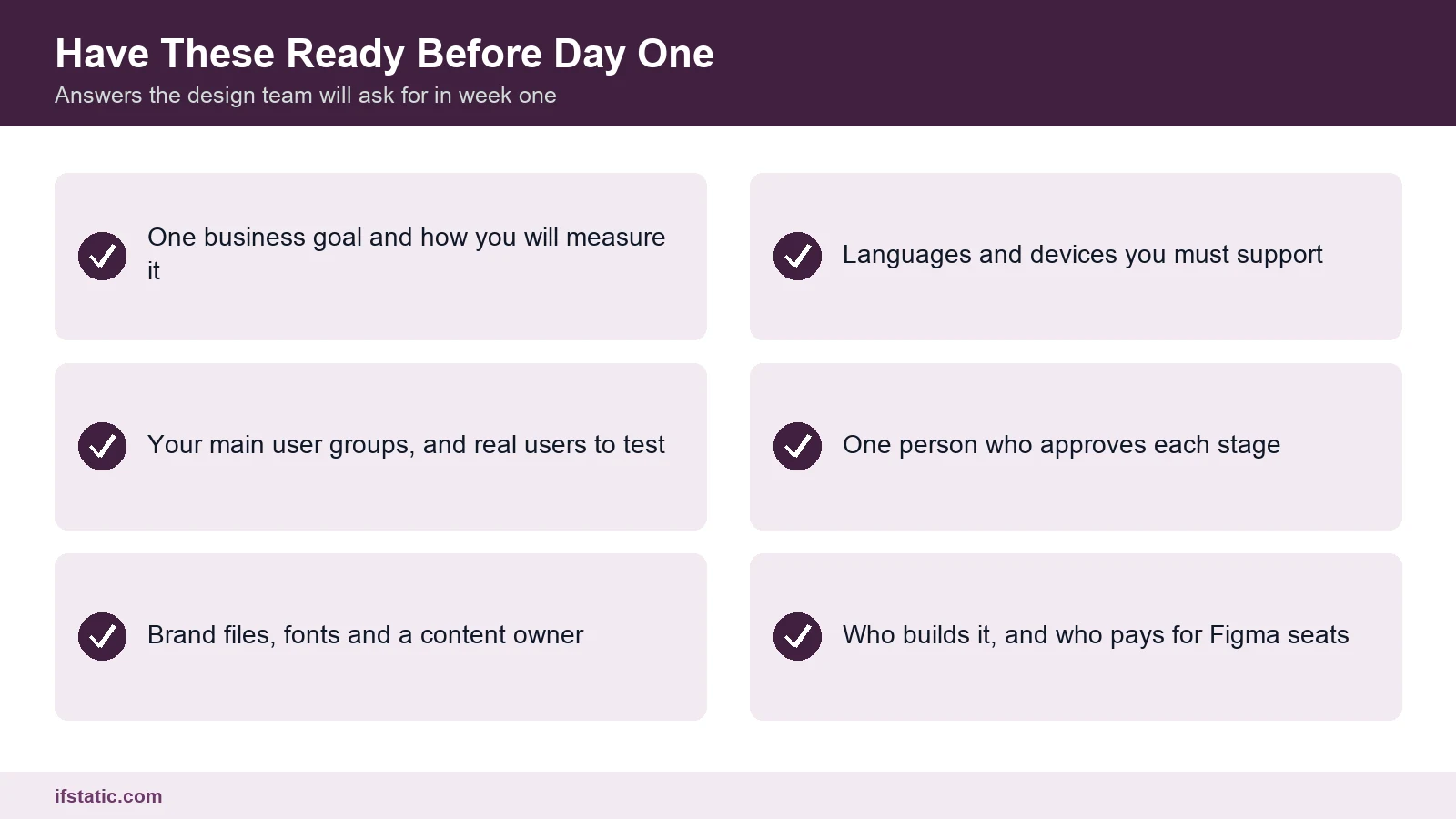
- What business result should this product change, and how exactly will you measure that change?
- Who are your primary user groups, and which segment matters most at launch?
- What do your users do today instead of using your product, and what frustrates them?
- Which competing apps or websites do your users already know, like or complain about?
- What is fixed and what is flexible: the budget, the launch date, the platforms or the integrations?
Stage 2: Information Architecture and User Flows
Information architecture, or IA, describes how content and features are grouped and named, and it is the skeleton that the whole product hangs on. The team maps every screen into a sitemap or app map, then draws user flows for key tasks such as sign-up, search, booking or checkout. Collaborative whiteboards such as FigJam and Miro make these diagrams easy to review together.
This is the right moment to bring in your technical lead or developer. A flow that looks simple on a whiteboard may depend on an OTP service, a payment gateway or a third-party API with its own rules. Catching that early keeps the design honest, and the stage usually takes one to two weeks, depending on how many user types and tasks the product serves.
- Which three tasks must a first-time user be able to finish without any help?
- What words do your customers actually use for your products and services?
- Which screens need a login, and which ones should work without one?
- What should happen when something fails, such as a wrong OTP or a declined payment?
Stage 3: Wireframes
Wireframes are plain layouts made of grey boxes, with no colour and very little styling, and they settle what sits on each screen and in what order. Judge wireframes on priority rather than appearance; if you find yourself requesting a different shade of blue, steer the review back to the primary action on each screen.
You receive wireframes for every key screen, often linked into a rough clickable flow in Figma so you can follow a task from start to finish. Sales, legal or compliance staff should review them now, because missing disclaimers or form fields are easy to add at this stage. Plan for one to three weeks, depending mainly on the number of unique screens.
- Is the most important action on each screen clear within a few seconds of looking?
- Is any content missing that sales, legal or support teams need to see on a screen?
- Are there screens here that nobody actually asked for, and could any of them be removed?
Stage 4: Visual UI and Design System
Now the product gets its look, which covers colour, typography, icons, spacing and motion. The team designs high-fidelity screens and, alongside them, a design system: a library of reusable components such as buttons, inputs and cards. It comes with a style guide explaining how to use each component, and it is what keeps screen forty consistent with screen four.
Accessibility belongs in this stage rather than in a later audit, and WCAG 2.2, the W3C's current accessibility standard, gives designers checks they can apply directly to screens. Ask your design team to show you where each check below is met before you sign off the visual design.
| WCAG 2.2 criterion | Level | What it asks for | What to check in the designs |
|---|---|---|---|
| 1.4.3 Contrast (Minimum) | AA | Text contrast of at least 4.5:1, or 3:1 for large text | Grey text on white, text on photos, button labels |
| 1.4.11 Non-text Contrast | AA | 3:1 contrast for UI parts and meaningful graphics | Input borders, icons, chart lines, toggle states |
| 2.5.8 Target Size (Minimum) | AA | Targets at least 24 by 24 CSS pixels, with listed exceptions | Close icons, small links, tightly packed chips |
| 2.4.11 Focus Not Obscured (Minimum) | AA | A focused element is not fully hidden by other content | Sticky headers, cookie bars, chat widgets |
| 3.3.7 Redundant Entry | A | Information entered earlier in a process is filled in or selectable, not retyped | Checkout and address forms, multi-step sign-up |
| 3.3.8 Accessible Authentication (Minimum) | AA | Login must not rely only on a memory or puzzle test | Password paste allowed, OTP or magic-link options |
Visual design usually takes two to four weeks in our planning estimate, and longer if you also want a full brand refresh at the same time. Keep the feedback focused by collecting comments from your team in one place, ideally as comments on the Figma file itself. Then send one consolidated set of changes rather than five separate opinions.
- Do you have brand guidelines, logo files and fonts with the correct licences for app use?
- Should the product match your current website, or is this a chance to refresh the brand?
- Which languages must the interface support on launch day, and which can follow later?
- Is accessibility a contract, tender or client requirement that you will need to prove?
Stages Five to Eight: Prototype, Test, Handoff and Iterate
The second half of the UI/UX design process turns approved screens into something people can try, proves it works with real users and gets it to developers. This is also where many projects lose time, because testing and handoff are the steps most often cut short when a launch date looms.
Stage 5: Interactive Prototype
A prototype links the screens together so that taps and clicks move you through the product as if it were already built. Figma handles most prototypes, while Protopie is useful when the team needs richer interactions such as gestures or detailed animations. You receive a link that you can open on your own phone and share with colleagues or investors.
A prototype is also a sales tool, since founders often use one to show investors or early customers the product before any code exists. Plan one to two weeks, depending on how many user journeys must be clickable from end to end.
- Which user journeys must work from end to end before testing can begin?
- Will you show the prototype to investors or customers before the build starts?
- On which phones, tablets and browsers should the prototype be checked before sign-off?
Stage 6: Usability Testing
Usability testing means watching real users attempt real tasks on the prototype without any help from the team. Research published by Nielsen Norman Group on testing with 5 users found that five users uncover about 85% of usability problems. Each individual user finds roughly 31% of them, which is why the returns fall so quickly after the fifth person.
The same article makes a second point that clients often miss. If you have budget for 15 users, run three rounds of five and fix the design between each round. When your product serves two distinct groups, such as buyers and sellers, it suggests three or four users from each group.
Your own employees are the wrong test group, because they already understand how the product is supposed to work. You receive a test plan with tasks, notes from each session, findings ranked by severity and a set of revised screens. Our estimate is one to two weeks per round, including recruiting, the sessions themselves and the fixes that follow.
- Can you help recruit real users from each key group, rather than colleagues or friends?
- Which tasks matter most to the business, so that they get tested first?
- Who from your organisation will observe the sessions live and take notes?
Stage 7: Developer Handoff
Handoff is where design turns into build instructions, and in Figma this now happens through Dev Mode, according to Figma's own guide. Developers can inspect layers, copy code snippets, read measurements and notes, and compare what changed since the previous version. Designers mark frames as ready for development, so nobody builds a draft screen by mistake.
One practical detail catches many clients out: Figma's guide says Dev Mode is available on all paid plans and needs a Full or a Dev seat. Budget for those seats early and decide who owns the Figma account. Zeplin is another handoff tool some teams use, and Jira holds the tickets that connect each screen to a development task.
Good handoff covers more than the happy path, so ask for empty, loading, error and offline states for each key screen. When the same partner also handles app development, design questions get answered in the daily stand-up instead of by email. Allow about one week for handoff, plus ongoing design support throughout the build.
- Who on your side owns the Figma account and pays for the developer seats?
- Is development in-house, or will the same agency that designs the product also build it?
- Where will developers raise design questions, in Jira or in another shared tool?
Stage 8: Post-Launch Iteration
Launch is the beginning of the most valuable feedback you will ever receive, because real usage shows where people drop off, what they search for and what confuses them. The design team reviews analytics, support tickets and app store reviews, then feeds the fixes into a UX backlog in Jira. Updated screens and components go back into the design system, so the next release starts from the latest version.
In our estimate, small fixes run in cycles of two to four weeks, while larger features go back through a shorter version of stages one to six. Set aside a modest budget for this before launch, because products that skip it tend to repeat the same mistakes in the next release.
- Which metrics will tell you whether the new design is actually working?
- Who collects user complaints and passes them on to the design team each week?
- How much budget have you set aside for design changes after launch?
How Long Each Stage Takes and Who Should Be Involved
Every UI/UX design process is different, so treat the ranges below as planning estimates rather than quotes. They assume a mid-sized app or web product with 25 to 40 unique screens, one lead designer with a part-time second designer, and client feedback within two working days. A small website progresses faster, while a complex platform with several user roles takes longer.
| Stage | Estimated duration | People from your side | People from the design side |
|---|---|---|---|
| Discovery and research | 1 to 2 weeks | Founder or product owner, sales or support lead, real users | UX designer or researcher, project manager |
| IA and user flows | 1 to 2 weeks | Product owner, content owner, tech lead | UX designer |
| Wireframes | 1 to 3 weeks | Product owner, sales, legal or compliance | UX designer |
| Visual UI and design system | 2 to 4 weeks | Product owner, marketing or brand lead | UI designer |
| Interactive prototype | 1 to 2 weeks | Product owner, sales | UI designer, prototyper |
| Usability testing | 1 to 2 weeks per round | Real users, one observer | Researcher or moderator, designers |
| Developer handoff | About 1 week, then build support | Tech lead, developers, QA | UI designer |
| Post-launch iteration | Ongoing, 2 to 4 week cycles | Product owner, support team | UX and UI designers |
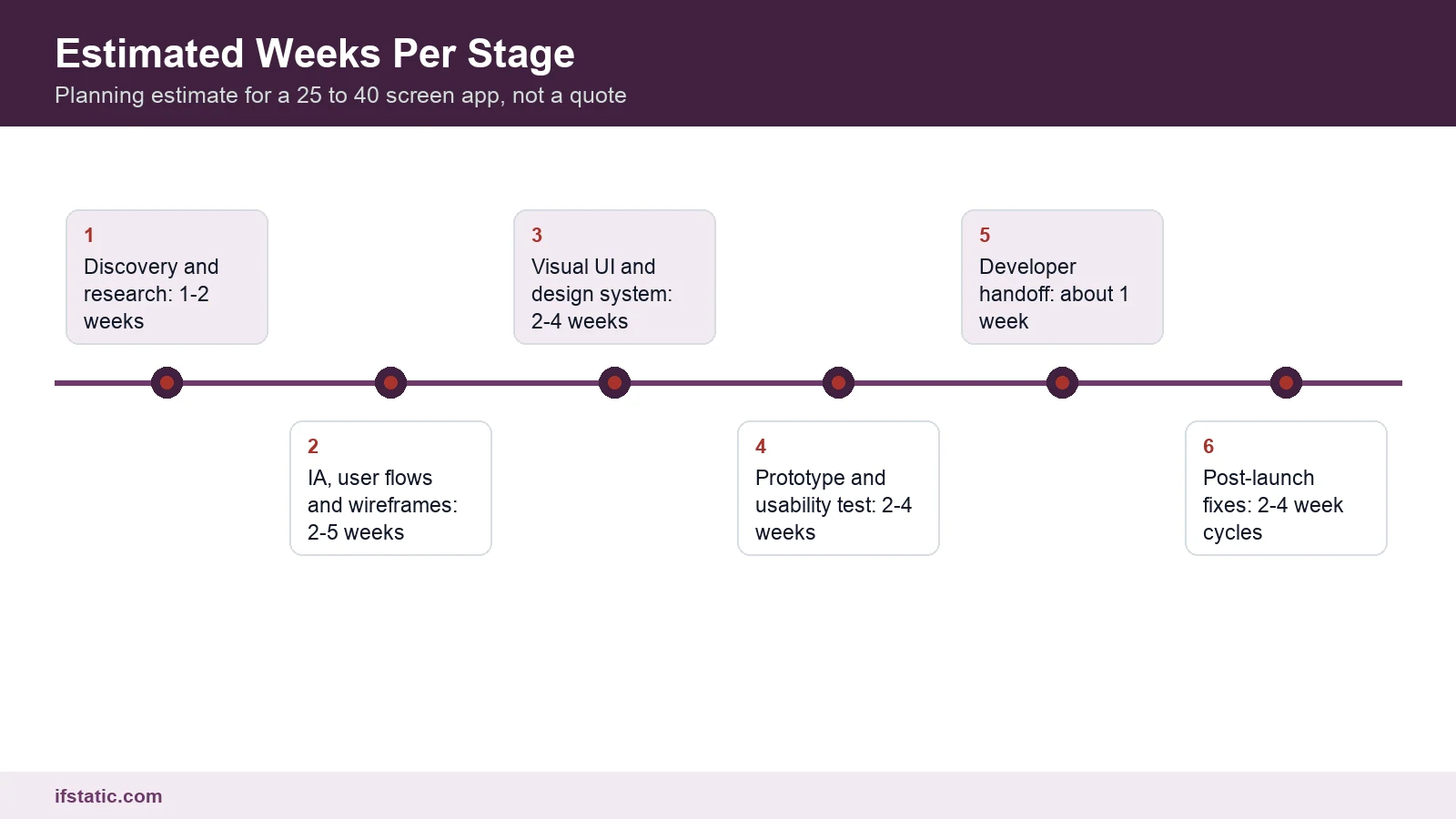
Added up, those ranges come to roughly 8 to 16 weeks before full development starts, although in practice the stages overlap. Wireframes for one flow can begin while research on another wraps up, and developers can start on approved screens during the last test round. Overlapping saves time, but it requires a clear owner for every unresolved question.
The biggest lever you control is feedback time, and simple arithmetic shows why. Assume a project has about ten review points: if each review takes five working days instead of two, you add three days ten times, or six working weeks. Design time is also part of the budget, as our guide to app development cost in India explains, and the four habits below keep reviews moving.
- Name one decision-maker who can approve each stage without waiting for a committee.
- Collect every comment in one place, such as the comments panel on the Figma file.
- Fix a weekly review slot in everyone's calendar before the project starts.
- Approve stage by stage, and avoid reopening signed-off screens without a clear business reason.
India-Specific Checks for Your UI/UX Design Process
Most process guides are written with users in the US or Europe in mind. If your users are in India, plan from the first wireframe for the phones people carry, the languages they read and the way they pay. Each of these changes the design itself, not just the testing.
Design for a Wide Spread of Android Phones
Android ran on 92.79% of the mobile devices in India tracked by StatCounter in August 2026, with iOS at 7.15%. That means your users carry an extremely varied range of Android devices across price points, screen sizes and operating system versions. A design that only ever gets checked on the designer's own phone is therefore a real risk.
Run the prototype on an entry-level Android phone as well as a flagship, and check text size, tap targets and the layout with the keyboard open. Ask for lightweight images, clear loading states and screens that still make sense on a slow connection. Our guide to the Android app development process covers the build side of the same problem.
Plan Hindi and Other Indic Language Screens Early
The IAMAI and Kantar Internet in India 2024 report counts 870 million people, or 98% of internet users, who used the internet in Indic languages in 2024. In urban India, 57% said they prefer Indic language content, and among people not yet online, 13% said content is not available in their language.
The same survey found that 20% of non-users describe the internet as too difficult to understand and use. For this audience, simple screens and plain words decide whether people use your product at all, and the design rules below help with multilingual screens.
- Pick fonts that support Devanagari and your other target scripts, and test them early on real screens.
- Leave extra room in buttons and menus, because labels change length after translation.
- Allow more line height, since Devanagari vowel marks sit above and below the main line.
- Keep text out of images, so every word can be translated and read aloud by screen readers.
- Place the language selector where users can find it on the very first screen.
- Have a native speaker review every string instead of trusting machine translation on its own.
Design UPI Payment Flows, Including the Awkward States
With UPI Intent, as described in Razorpay's UPI Intent documentation, the customer picks a UPI app from a list. That app opens with the payment details already filled in, the customer enters their UPI PIN and is then returned to your product. On desktop, where intent is not available, a QR code appears instead.
Razorpay suggests showing the top-performing UPI apps first and listing the rest separately, and on iOS its intent flow works with Google Pay, PhonePe, CRED, Paytm and BHIM. The part designers often skip is the return trip, so design screens for a pending payment, a failed payment, a timeout and a user who comes back without paying.
| India check | Why it matters | How to test it in the design stage |
|---|---|---|
| Entry-level Android phones | Android held 92.79% of India's mobile OS share in August 2026 (StatCounter) | Open the prototype on a low-cost Android phone with the keyboard up |
| Hindi and other Indic screens | 57% of urban internet users prefer Indic content (IAMAI and Kantar 2024) | Design one key flow in Hindi before visual design is signed off |
| Plain, simple wording | 20% of non-users find the internet too hard to use (IAMAI and Kantar 2024) | Test copy with users who are not tech-savvy and note every pause |
| UPI app picker | Intent flow opens the chosen UPI app with details pre-filled (Razorpay) | Check app order, the desktop QR fallback and the return screen |
| Payment states | Users can come back to your app before the payment settles | Design pending, failed, timeout and cancelled screens in the prototype |
How Much Process Does Your Project Need?
Not every project needs the full UI/UX design process at the same depth. The right amount depends on how new the product is, how many kinds of users it serves and how costly a mistake would be. Use the table below to choose, and be honest about where your project really sits.
| Approach | What it includes | Good fit | Wrong fit |
|---|---|---|---|
| Full eight-stage process | All stages, two or more test rounds, a full design system | New products with several user groups or payments | Wrong fit: a five-page brochure website |
| Lean process | Short discovery, IA and wireframes combined, one test round | An MVP with one clear user group | Wrong fit: products where an error costs users money |
| UX audit and redesign | Review of a live product, analytics, fixes to key flows | A live product with visible drop-offs | Wrong fit: a product with no users yet |
| Design only, your developers build | Stages one to seven, with a Dev Mode handoff | Firms with an in-house development team | Wrong fit: no tech lead to answer design questions |
| Theme or template customisation | Visual changes to a ready-made theme | A quick marketing site on a tight budget | Wrong fit: an app with custom flows and roles |
A lean process suits a first version that has to reach users fast, and our guide to MVP app development explains how to scope one. Even a lean project should keep at least one round of usability testing, since it is the cheapest insurance in the whole process and the step most often dropped.
Whichever option you choose, write it into the proposal, listing the stages, the deliverable for each, the number of revision rounds and the number of test users. A clear scope protects both sides when the inevitable request for one more screen arrives.
Conclusion
A good UI/UX design process is not a black box, but eight stages, each with a deliverable you can see, question and approve. Your responsibility is to arrive with clear goals, real users and prompt feedback, and the design team's responsibility is to turn those into usable screens. You can browse our UI/UX design portfolio for examples of that kind of work.
If you are planning a new app, website or dashboard, bring your goals, your users and your deadline to a first conversation. We will map the stages to your project and tell you honestly which ones you can shorten, so contact IfStatic for a scoped plan and a quote.
Frequently Asked Questions
What are the main stages of the UI/UX design process?
From a client's perspective, the process contains eight distinct stages. They are discovery and research, information architecture and user flows, wireframes, visual UI and design system, interactive prototype, usability testing, developer handoff and post-launch iteration. Each stage ends with a deliverable you review, such as a sitemap, wireframes or a clickable prototype, and teams often loop back when testing shows a problem.
How long does the UI/UX design process take?
As a planning estimate, a mid-sized app with 25 to 40 unique screens takes roughly 8 to 16 weeks from discovery to handoff. That assumes one lead designer, a part-time second designer and client feedback within two working days. Small websites move faster and complex platforms with many user roles take longer, while slow reviews stretch every timeline.
How many users do I need for usability testing?
Nielsen Norman Group found that five users uncover about 85% of the usability problems in a design, so it recommends several small rounds of five with fixes in between. If your product serves two distinct groups, such as buyers and sellers, test three or four users from each group rather than five in total.
What should I prepare before hiring a UI/UX design agency?
Prepare one clear business goal with a way to measure it, a description of your main user groups and your brand files and fonts. Also list the languages and devices you must support, and name one person who can approve each stage. Finally, decide who will build the product and who owns the Figma account, because developers need paid seats to use Dev Mode.
Do developers need a paid Figma seat for handoff?
For Dev Mode, yes, because Figma's own guide says it is available on all paid plans and needs a Full or a Dev seat. It lets developers inspect designs, copy code snippets, read annotations and see what changed between versions. Some teams use Zeplin for handoff instead, but either way you should budget for tool access before the build starts.
Should my app support Hindi at launch?
If your users are in India, plan for it from the wireframe stage, even if you launch in English first. The IAMAI and Kantar 2024 report found that 57% of urban internet users prefer Indic language content. Choosing fonts with Devanagari support and leaving room for longer labels early costs far less than retrofitting a finished design.
Sources, Method and Author
How this guide was researched: on 25 September 2026 we reviewed the Google India top 10 results for this keyword and read seven of those pages in full. We then opened every primary source linked above. The durations are our planning estimates with the assumptions stated, not measured averages. We could not open NPCI's UPI statistics page (access denied) or Adobe's XD help pages (blocked), so no UPI volume figures are used here.
About the author: Aman Raj is a Director and Website Designer at IfStatic Technologies in Greater Noida West. He works on the design, build and launch of websites and apps for IfStatic clients and writes the company's guides on planning digital projects.