
E-Commerce App UI Design
₹48,000 INRThey delivered an excellent UI for our e-commerce app. Smooth navigation, beautiful product screens, and a modern checkout flow. Great attention to detail.
App UIUX StrategyInteractions

Harsh M.
Mumbai, India
Loading
UI/UX DESIGN FOR GURUGRAM (GURGAON)
People in Gurugram (Gurgaon) judge a new screen against the apps they already open daily: hospital booking apps, civic portals, office dashboards and QR menus in restaurants. Looking for a UI/UX design company in Gurgaon that puts screens in front of real users before development starts? IfStatic researches, wireframes and designs app, website and dashboard interfaces. Most projects are drawn in Figma; Adobe XD is used if your current files are already there. Our designers sit in Greater Noida West, also in the NCR, so reviews happen over video and shared files, and an in-person workshop in Gurugram can be arranged. Explore our UI/UX design services or request a free consultation.

OUR DESIGN PROCESS

We begin over video, or at a Gurugram workshop when one can be arranged, with the product owner and someone who handles customer complaints. We agree the business goal, the user types and the few tasks that matter most. Then we interview a small group of real users, such as receptionists, field supervisors or regular customers, and read your analytics and support tickets. You receive a one-page summary of goals, users and pain points, which every later design decision is checked against.
Next we sort your content into a structure people can predict. Each key task then becomes a flow, such as booking a slot, approving an expense or paying society dues. Grey wireframes in Figma show layout and wording without colour, so feedback stays on whether the path works. Your team leaves comments directly on the file, and we revise until one named decision-maker signs off. Labels, error messages and search terms are written here too, including the local place names your users actually type.
Signed-off wireframes become finished screens with your colours, type scale and icons, plus the states teams forget: empty lists, failed payments, weak signal and long names. We link them into a clickable prototype and run short remote sessions in which users share their screen and think aloud. Wherever someone hesitates, the design changes and the test repeats. Contrast, text size and tap targets are checked against accessibility guidance now, while fixes cost minutes rather than a new release.
At handoff your developers get one organised Figma file: a component library, colour and text styles, spacing values, exported assets and a written note for each animation or tricky interaction. Whoever writes the code, whether our developers, your in-house engineers or another vendor, can ask us questions during the build. Before release we compare the coded screens with the approved design and log every mismatch, so small drifts do not pile up across sprints.
TOOLS WE USE













WHAT WE DESIGN
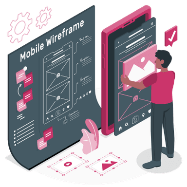
Phone screens planned for one-handed use, budget Android handsets and bright daylight. In Gurugram, Artemis asks patients to book appointments through its ArtemisPHR app, so a clinic or lab app will be compared with hospital apps like that one. Android layouts follow Material Design 3 and iPhone layouts follow Apple's Human Interface Guidelines, so each feels at home on its platform.
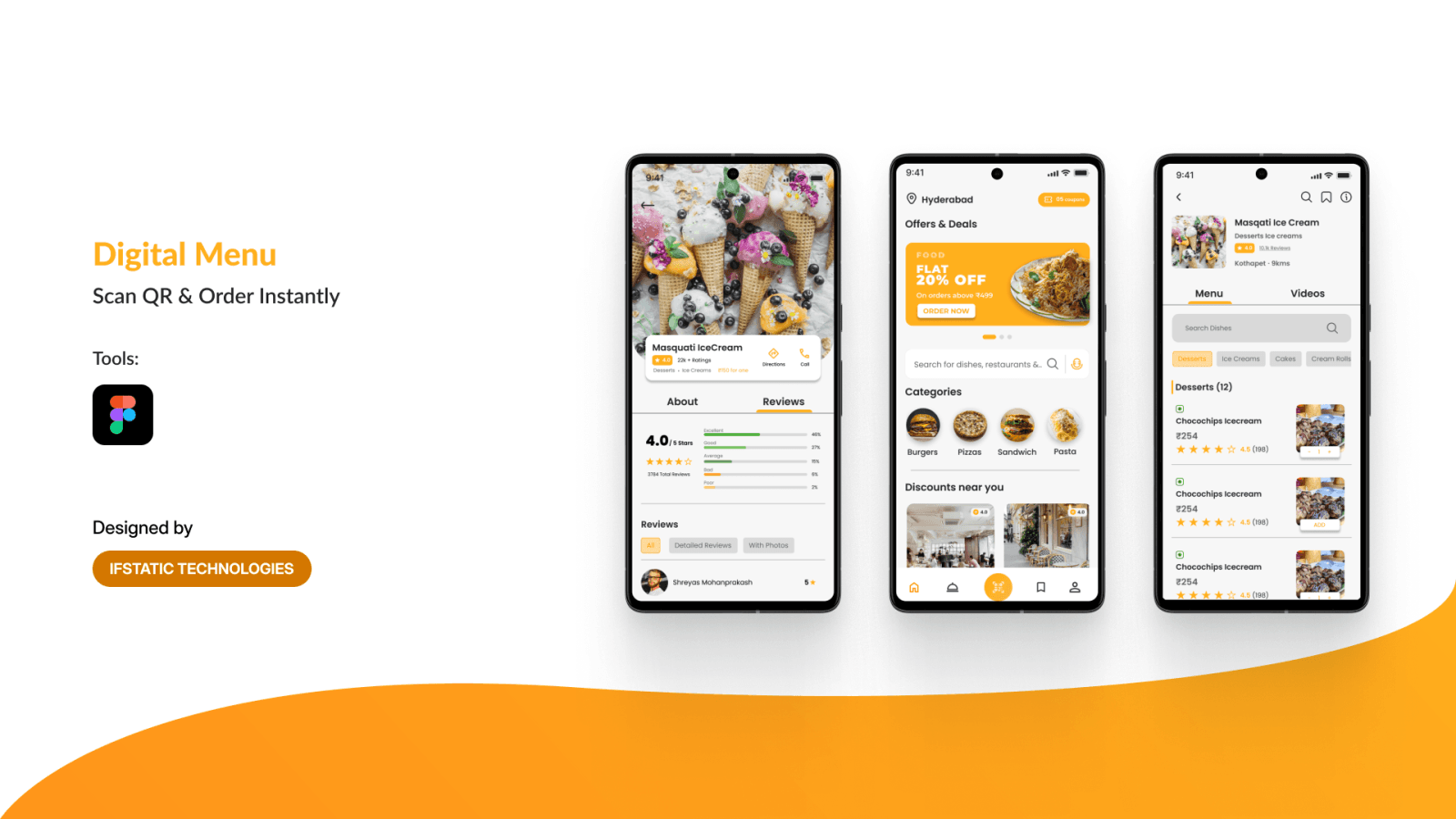
Mobile-first page layouts for visitors who decide within seconds. DLF describes CyberHub as one place for shopping, dining, culture and entertainment, known for its nightlife. Venues there need menus, offers and table booking that work on a phone in low light. We designed Digital Menu, an app for QR table ordering, with this flow in mind: a diner scans the table code, browses a categorised menu with live prices, then orders without waiting for staff.
Screens for people who spend whole shifts inside one tool. DLF counts Fortune 500 firms and global capability centres among the occupiers of its office portfolio, which includes Cyber City. Haryana's 2020 enterprise policy also describes Gurugram as a BPO hub with about 5% of the world's BPO workforce. Agent consoles, approval queues and reporting views for such teams need compact tables, saved filters, bulk actions and keyboard shortcuts.
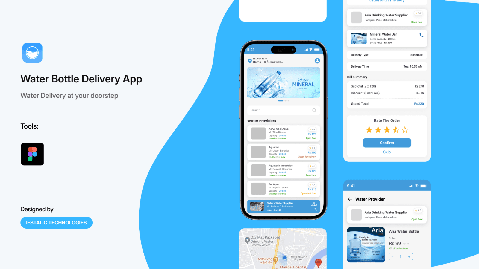
The thinking behind the screens: every user type, the job each one came to do and the fewest steps to get it done. Gurugram residents already switch between civic channels: MCG lists 28 online services, and GMDA has its own myGurugram app and WhatsApp complaint line. A society or facility app should not add another maze. WaterGo, a water delivery app we designed, maps two journeys together: households booking bottles with flat details, and vendors clearing delivery lists sorted by route.

Clickable prototypes let you test an idea, or pitch it, before paying for development. Medanta's Gurugram hospital page offers an app download, telemedicine and homecare. A smaller clinic planning a video consult service can prototype that journey first: booking, payment, the virtual waiting room and the prescription. A tappable Figma flow in front of a few patients reveals more than any slide deck, and changing it costs far less than changing code.
A documented library of tokens, components and usage rules, so each new screen matches the last without debate. It matters most when several teams ship under one brand. DMRC calls Global Business Park, near gate 1 of Guru Dronacharya station, a hub for IT companies. A company there with several products gains from one shared kit: one button style, one date picker and one set of form rules across every app and portal.

Custom icons, illustrations and empty-state artwork that make screens quicker to scan, especially for users moving between Hindi and English. Staff apps for large plants show why. Suzuki Motorcycle India, whose factory is in Sector 75A, lists more than 4,700 employees. Shift rosters, safety checklists or payslip screens for a workforce that size work better when every action carries a clear, consistent symbol next to a short label.
A structured review of a live app, website or dashboard using analytics, usability heuristics and recorded sessions, ending in fixes ranked by impact and effort. Typical findings include a sign-up that asks too much, a checkout that buries UPI and an address field that refuses 'Gurgaon'. We redesign the costliest flows first and hand them over in small batches your developers can ship quickly.
WORK
TESTIMONIALS
E-Commerce App UI Design
₹48,000 INRThey delivered an excellent UI for our e-commerce app. Smooth navigation, beautiful product screens, and a modern checkout flow. Great attention to detail.
Mumbai, India
Dashboard UI for SaaS Platform
€320 EURThe dashboard design is extremely user-friendly and visually clear. They created a perfect balance between aesthetics and functionality. I’m very impressed!

Berlin, Germany
Website UI Design for Startup Landing Page
$180 USDIncredible work! The landing page design looks premium and professional. The team understood the brand perfectly and delivered pixel-perfect screens.

San Diego, USA
Mobile App UI/UX Redesign
₹22,000 INRThey completely transformed the look and feel of my mobile app. The new UI is clean, modern, and far more intuitive. My users love the improved flow and navigation!

Bengaluru, India
E-Commerce App UI Design
₹48,000 INRThey delivered an excellent UI for our e-commerce app. Smooth navigation, beautiful product screens, and a modern checkout flow. Great attention to detail.
Mumbai, India
Dashboard UI for SaaS Platform
€320 EURThe dashboard design is extremely user-friendly and visually clear. They created a perfect balance between aesthetics and functionality. I’m very impressed!
Berlin, Germany
Website UI Design for Startup Landing Page
$180 USDIncredible work! The landing page design looks premium and professional. The team understood the brand perfectly and delivered pixel-perfect screens.
San Diego, USA
Mobile App UI/UX Redesign
₹22,000 INRThey completely transformed the look and feel of my mobile app. The new UI is clean, modern, and far more intuitive. My users love the improved flow and navigation!
Bengaluru, India
E-Commerce App UI Design
₹48,000 INRThey delivered an excellent UI for our e-commerce app. Smooth navigation, beautiful product screens, and a modern checkout flow. Great attention to detail.
Mumbai, India
Dashboard UI for SaaS Platform
€320 EURThe dashboard design is extremely user-friendly and visually clear. They created a perfect balance between aesthetics and functionality. I’m very impressed!
Berlin, Germany
Website UI Design for Startup Landing Page
$180 USDIncredible work! The landing page design looks premium and professional. The team understood the brand perfectly and delivered pixel-perfect screens.
San Diego, USA
Mobile App UI/UX Redesign
₹22,000 INRThey completely transformed the look and feel of my mobile app. The new UI is clean, modern, and far more intuitive. My users love the improved flow and navigation!
Bengaluru, India
FAQs
Have questions or need more information?